A quick search on Google will show thousands of results on inquiries similar to “How to design a website” or “Best web design platform”. Unquestionably there are far too many tools, platforms and software available today that allow us to create websites.
So how should one decide? And why is guide focused on WordPress and it’s popular plugin Elementor?
There’s no doubt that different tools are superior in particular areas, but in general we believe the popularity of WordPress is justified — it is a well-rounded tool that can tackle most web design projects. WordPress paired with Elementor strike the sweet spot between customizability, functionality and creative flexibility for web designers.
Who is this designer’s guide for?
Current or aspiring web designers who were taught (especially through formal education) or self-taught broad design-thinking methodologies, strategies and techniques and are interested in learning technical skills to build WordPress websites.
But of course this information applies to anyone interested in learning more about WordPress and in particular, Elementor. Those generally interested in web design, design students, hobbyist designers and even business owners looking to build their own WordPress website.
Having graduated from OCADU’s (Toronto, Canada) design program, I’ve experienced first-hand the institutional approach to design education. We were taught insightful and truly useful approaches to design, which ultimately formed the foundation to my design career, but often times lacked in-depth technical training with tools commonly used in the design industry. I hope this guide can provide designers who are currently in similar situations some insight and useful practices in creating their first WordPress website using Elementor.
Why WordPress?
If you are the type of designer described above, one formally educated in design, it would be shameful to even consider using WordPress as the preferred platform for building a website. You’re taught tools within the Adobe Suite (Illustrator, InDesign, Photoshop, XD) or you have experience with UI tools such as Figma or Sketch — so why consider WordPress? It’s common and practical to learn how to create everything from scratch and with complete flexibility using those type of tools/software.
In the real world however, there are: time, budget and other flexibility restrictions that may not always allow for full creative freedom. So as designers it’s important to know how to work within boundaries and still deliver high-quality work.
From experience, we’ve worked with clients who preferred WordPress because they can manage the end results easier. They can make changes on the platform themselves and even add content if necessary. And that can, depending priorities, trump any design choices.
That’s not to say you should only choose WordPress because you’re restricted to it. There are still clear advantages to the platform despite limitations. It is still the most popular website builder on the web. WordPress operates on a developer-friendly network of plugins and themes that provide solutions and functionality for most web design projects. With the click of a button you can integrate a testimonial panel on your website. Not the style you want? There are hundreds more available.
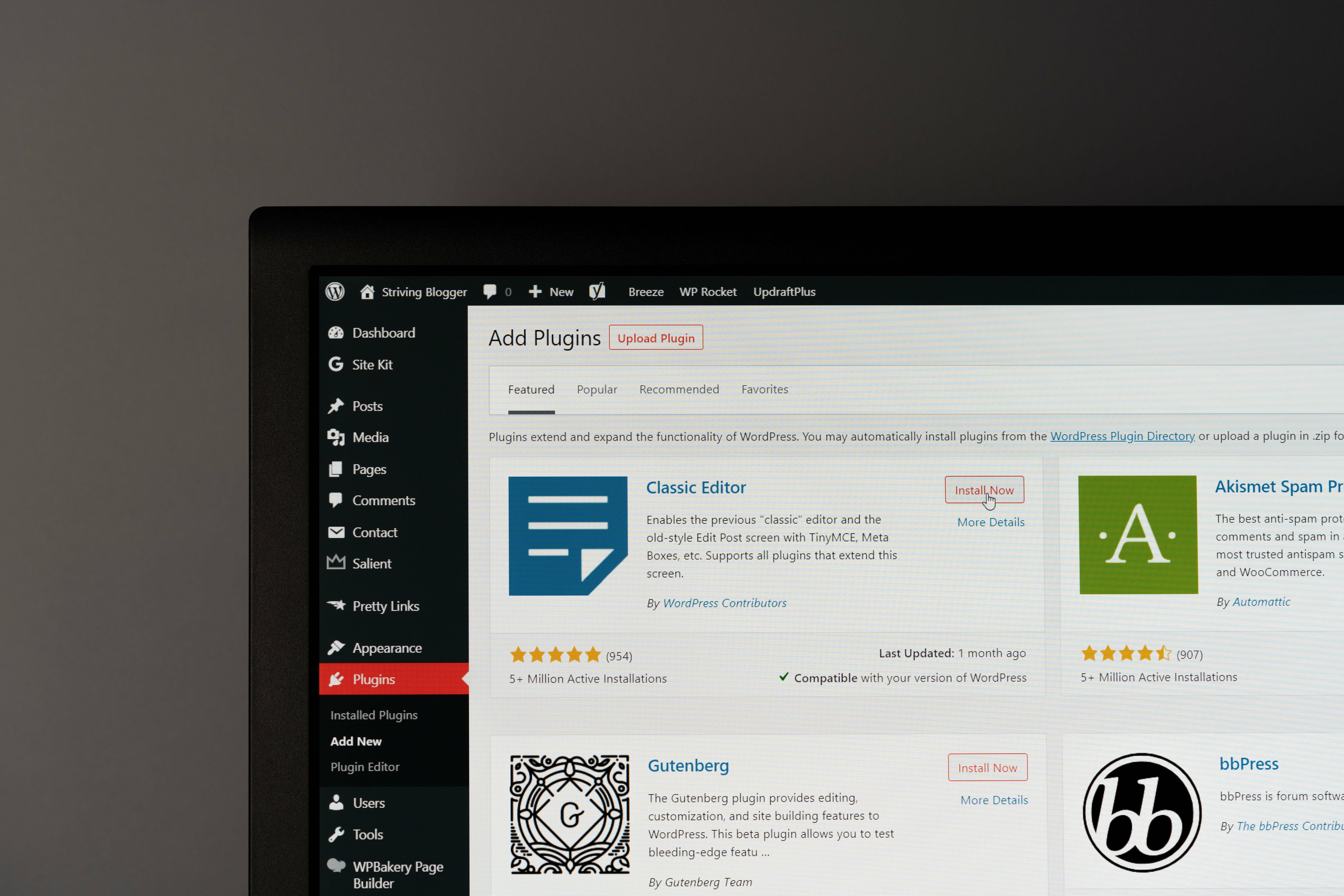
That is the power of the expansive library of ready-made and customizable features that WordPress provides. SEO tools, contact forms, calendar integration tools, anything you can imagine to enhance or provide critical functionality for any WordPress website. And of course website builder plugins like Elementor are available on WordPress to offer greater versatility, especially for designers.
Why Elementor?
So now we know why WordPress can be the ideal solution for your web project. But what about the website builder Elementor? What about the default WordPress page builder?
Elementor offers a live drag-and-drop visual editor that can create complex layouts onto of WordPress’ infrastructure. Whereas the default WordPress page builder is oriented for blogging — in fact WordPress was originally created as a blogging platform but has evolved overtime into a powerful CMS (content management system).
Elementor fills the void in WordPress’ lack of design customizability. It’s a page editor that designers who have experience with more complicated software (Figma, Adobe, etc.) will find comfort in after a short learning period. On top of that, no coding is necessary to use Elementor, but some coding competence will be useful for more advanced designs.
Figma vs Elementor
As discussed, Elementor is a page builder — it’s a plugin on-top of a framework built for creating one thing. Web pages.
Figma on the other hand is a flexible and powerful design application with features that focus on user interface (UI) and user experience (UX) design, but can be used to design much more.
So how do the two platforms compare?
Fundamentally Figma and Elementor solve different problems, and are not direct competitors. Figma can be used to create non-functional website prototypes, like a blueprint for a building. While Elementor is used to create live websites directly on its page builder — with frontend features natively accessible on the Elementor editor.
At Crushing Cones we built our website on WordPress + Elementor. But most asset you see were created and edited on Figma. Text, certain images and widgets (such as dividers and spacers) are easily created in Elementor. However, more complex graphics require design tools like Figma. For example: the floating logo on our homepage was designed on Figma, exported as a PNG and placed in Elementor. From there, a floating effect was enabled on the image using a third-party plugin. We have WordPress as the foundation, Elementor as the builder, Figma to create the assets, and WordPress’ expansive plugin library for all the bells and whistle.
Figma vs Elementor can be reframed as custom web design vs WordPress web design. If you’re using Figma for web design it would require a developer or development team to take your blueprint and build it with your provided specifications and assets. If you’re using WordPress, Figma can be used supplementally for more complex graphic elements. Remember, as designers it’s important to be agnostic towards design tools and use them deliberately to solve different problems.
Hopefully you have an idea of how different tools can work together, especially popular ones like Figma, but now back to using Elementor on WordPress.

Using Elementor
We will be skipping the web hosting selection process of getting WordPress operational. For that information, view our guide where will go over that process in deeper detail. Instead we will approach this article from purely a designer’s perspective and how they can take advantage of the features of WordPress + Elementor to create stunning websites.
The first concept to grasp as a designer using WordPress and Elementor is that they sit on top of each other. They work together. After installing and activating Elementor on a page, it takes over the existing default page builder and becomes the way you edit that page visually.
It’s important to note that there is still an element of control from WordPress and the theme directly that cannot be edited using Elementor. For example, if you have a certain header set up for your theme, it cannot be removed by Elementor. You have to change the settings of that theme through the page editor (from your website’s dashboard, navigate to → pages → hover over the page you want to edit and select “edit” → make the theme changes here). A useful edit to consider on this page is the width options — you may find yourself stuck on a default page width and want to design using 100% full screen width. That can easily be changed in this same edit page.
You can make these changes on the theme directly (from your website’s dashboard, navigate to → appearance → customize), but that would impact every page on your website.
Generally when I design on Elementor + WordPress, I think of the overall theme’s settings as the base. I make edits site-wide features like typography, page widths and background colours. From there I can make page to page adjustments from the WordPress page edit (be mindful not to confuse this with the WordPress Editor). And once everything is set, I can directly work on the layout and visual design using Elementor.

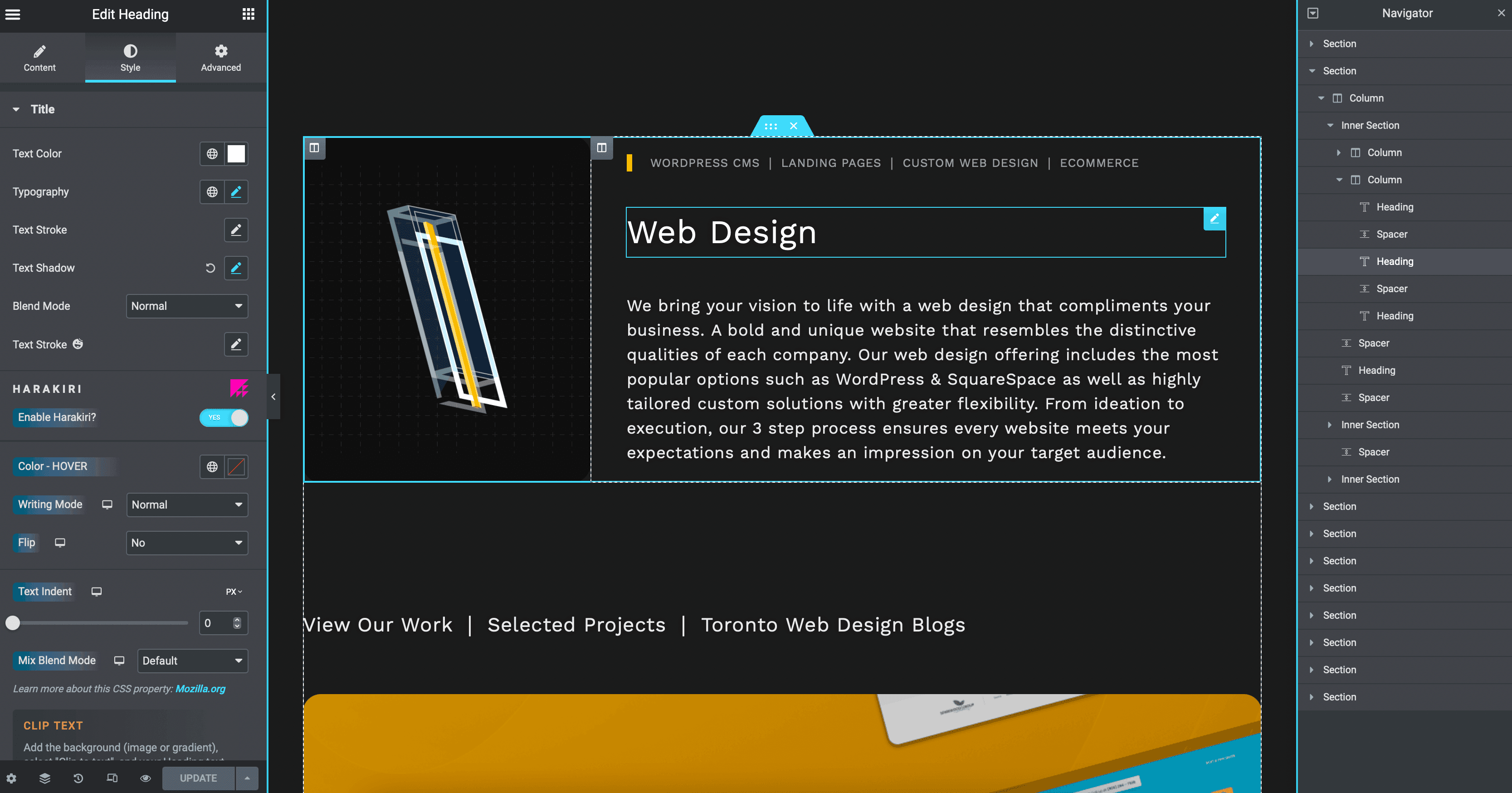
Here's an example of working with sections, columns and elements on Elementor. The heading element is nested in the column on the right (set to 70% of the width of the section) which is nested in the section. And this is also displayed in the navigator on the right which can be toggled open with the layers icon located next to the settings icon on the bottom left of Elementor.
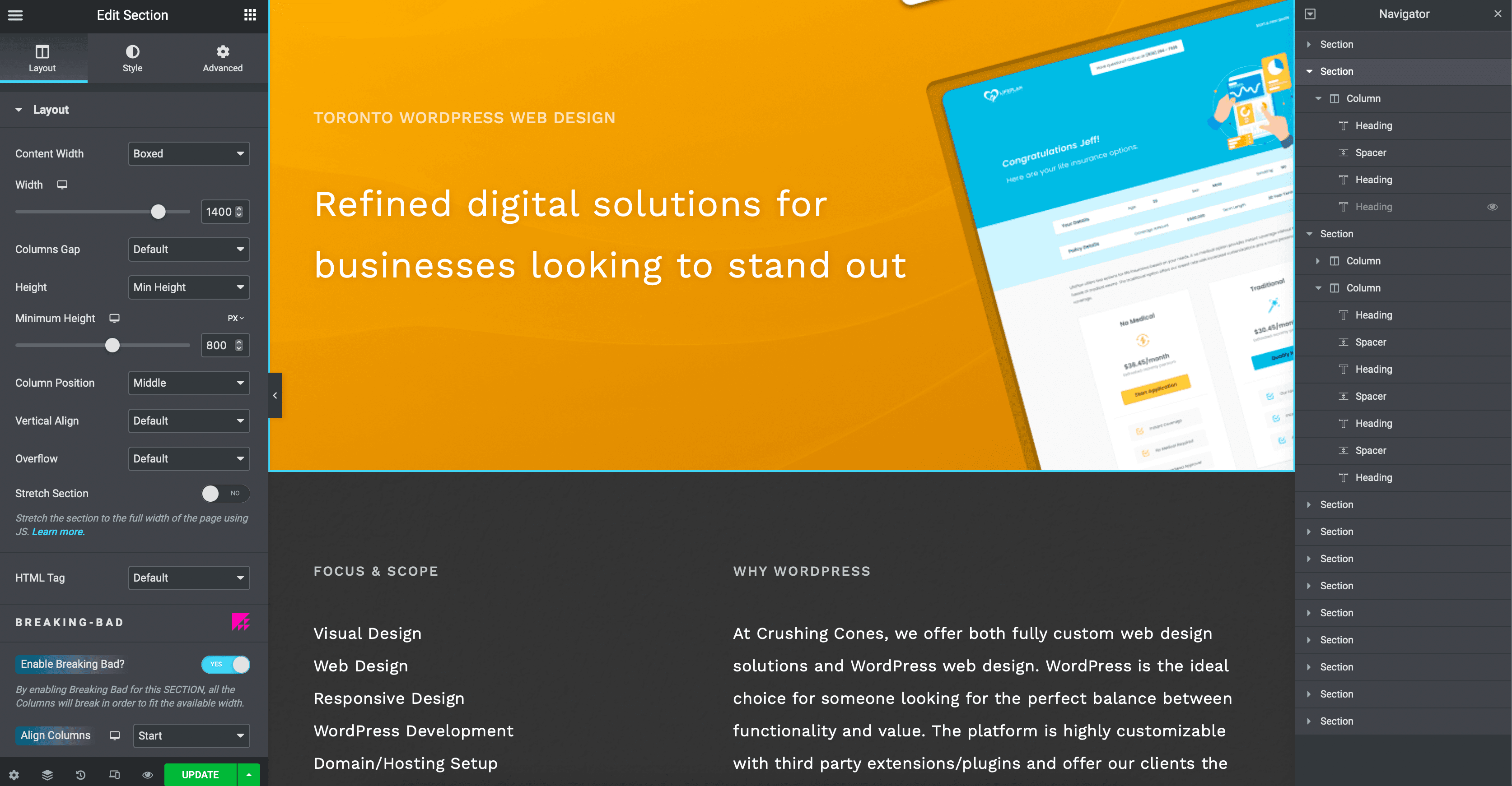
To visualize how Elementor works, think about design blocks stacked on each other. Blocks for Elementor start with sections. They’re the structure of each segment. Within them you have columns — here you can select your structure and choose the width percentages of each column, but they can be changed directly on the column’s layout settings as well. It’s important to conceptualize these structures as nested components.
And finally, inside the columns, we have elements. This will be where you can drag-and-drop text, images, spacers, divider lines and elements like buttons directly onto the columns.
You have columns that contain elements that are nested in sections. All of them have their own settings (layout, style, margins/padding can be found in advanced settings) and everything can be moved around using the live frontend builder.
Elementor and WordPress are both tools that can be used to solve web design problems. The drag-and-drop visual editor of Elementor paired with WordPress’ comprehensive development resources is hard to beat.
Thinking Past the Page Builder
In part 2 of this design guide we will dig deeper into the technical intricacies and breaking the limitations of Elementor and WordPress. From useful plugins to obscure strategies directly on Elementor, we will show you how to design complex and high-quality WordPress websites.


