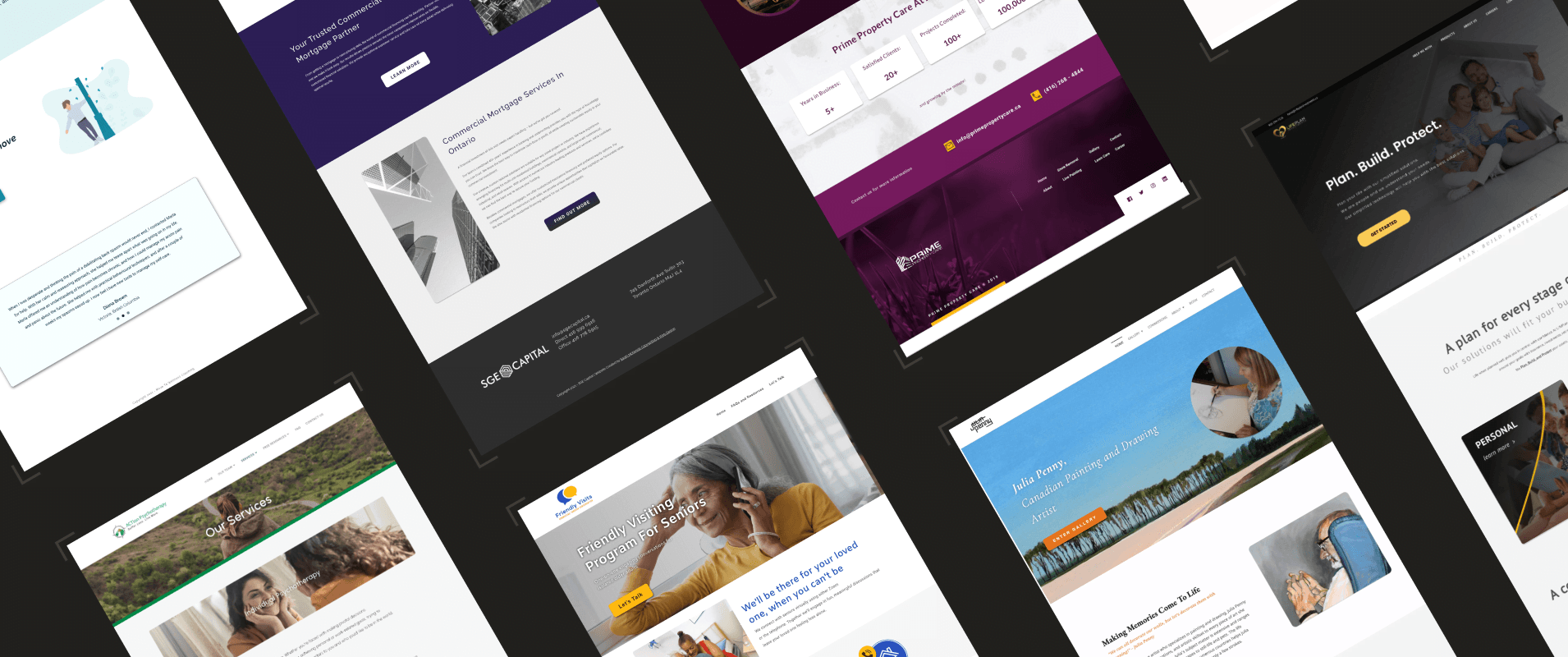
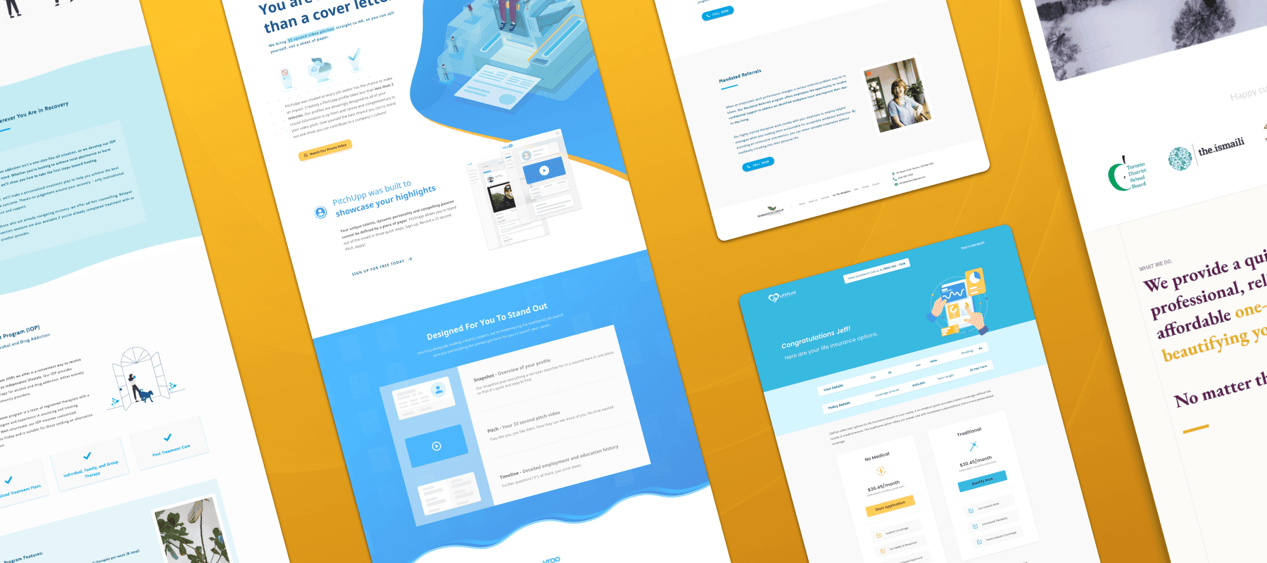
Today we will define web design and consider how we should conceptualize web design in our crowded digital world. Broadly speaking, websites are a type of media — typically consumed for educational, informational or recreational purposes.
Like books and films, websites are essentially tools that deliver information. The invention of the printing press gave us the ability to mass deliver information in written form. While film and optics technology allowed us to create and broadcast information visually. And similarly the creation of the internet (World Wide Web) let us design and view digital media virtually — with both text and images. Put simply, web design is the craft of creating websites that are accessible online.
I bring up the history of adjacent forms of media because it’s important to consider the historical context of tools around us and not take them for granted. Of course tools naturally change and evolve over time but knowing its history can give us valuable insights and perspective as to how we can approach them.
Websites generally provide information. Whether it’s for a brand, an idea, for research or even to incite an emotion — there’s always a message and a reason. The first question a web designer should ask isn’t how the website should look, instead it should be: what is this website trying to convey?
And with that function identified, form can follow. Meaning, the visual elements of a website will come naturally (at least broadly) after determining its intent, message or the information it’s attempting to convey.
Web design, and design in general, involves the process of: planning, conceptualizing, executing and iterating. You start with the purpose and strategize around it. Some websites are straightforward and the planning stage may be simple. While other websites can be more complex and require deeper consideration. For example, a landing page for a new cafe can be more straightforward structurally than a university’s website with a student portal.
Think of a website like a home or a building. They are built for different purposes and solve different problems. From size to layout, exterior features and interior design, all homes are built different and serve different purposes for different people. And similarly, websites are not and should not be one-size-fits-all.
Web design is user-centric. A web designer is typically not the target audience for the website they design. So web designers have to be open-minded and continuously conscious of the fact that they are not the end-user. It’s easy to design for your own taste, but it’s far more difficult to design for someone else’s. Web designers have to empathetic and acutely aware of how someone would interact with their product.
Not only are web designers not designing for their own tastes, they are also not designing for their own screens. Glance around and you’ll find computer monitors, tablets and phones of varying sizes. Responsive web design is undoubtedly mandatory in today’s digital world. And neglecting it reveals a severe lack of refinement and can ultimately turn away potential clients.
For web designers it is important to test and view their layouts on multiple devices and different resolutions to ensure their website is displayed as intended. Generally it’s useful to consider all screen sizes before designing, especially for more unique ideas that follow less rigid layouts. Try to imagine how the same content would be displayed on a screen as the width expands and constricts. Can the same information be displayed on a small screen? Does the visual hierarchy change on different devices? Content that’s displayed left to right now have to be displayed top to bottom. On top of that, websites are viewed on different browsers and platforms — such as Apple’s Safari, Google’s Chrome and Mozilla’s Firefox.
Today web design is more accessible than ever. Templates, resources, and applications are built to streamline the web design process. Big names include SquareSpace, Wix, WordPress and there are even No-Code development tools that allow non-programmers to create complex software without writing a single line of code.
The barrier to entry for creating a website today is low, but we found from our web design business that only a certain group of people are able to take advantage of these tools and most still required professional assistance. Products like Wix offer all-in-one solutions, but they lack customizability and functionality. Whereas products like WordPress offer more possibilities, but require more technical competence.
These are merely a few of the many tools available today. But remember, you can and should use different tools to solve different needs — all websites don’t need to have the latest capabilities or trendiest aesthetics. Today, it is paramount to have some form of online presence, so web design is often a requirement and not a luxury.
As mentioned, the visual elements of a website should follow its function — it should follow what it’s attempting to convey. If we revisit the example above, the layout of a cafe’s landing page will naturally differ from a university’s website. And the visual design starts with that foundation.
Visual principles for web design follow similar principles to other forms of visual design. But with the added dimension of its output —viewed on a digital screen. Colour theory, typography, layout design and imagery are all considered and utilized in web design. Good web design incorporates aesthetically pleasing visual elements without comprising the content and message of a website. Instead they elevate the overall experience of a website. They take, even mundane, content and make it enjoyable.

Visual hierarchy is essential in web design. Hierarchy can be applied to highlight specific elements and bring others to the background. Imagine a website with every line of text in the same size. Good visual hierarchy helps viewers pinpoint the elements they should be focusing on — for example a call to action (CTA) button should be visually identifiable, whether that be through colour, typography or scale.
Overall, web design is a combination of strategy, visual design and programming. It is both an art and science that is typically created with a predetermined target-user but a wide range of viewing devices. It is important to consider the purpose and message of a website before the design process and it can be beneficial to take advantage of the many available tools we have online today.


