
Good web design is essential for any business or organization that wants to succeed in today’s competitive environment. Now more than ever, any business owner looking to design their website must consider the importance of good web design. But what constitutes as good web design? And how can one accurately identify the difference between good and bad web design? Today we will be looking at common themes and signs of good web design that allow you to make better web design decisions.
Clearly Defines Business and Value Proposition
Conveying a clear, direct and purposeful message is the first and foremost important sign of good web design. A good website clearly defines its value proposition and allows the business to stand out from the crowd. Remember, much like a storefront or any marketing material, your website is an extension of your business and its products or services.
It doesn’t matter how visually attractive or how many animations you have on your website, you risk potential sales if your business proposition isn’t immediately apparent. People have short attention spans, especially in this digital age, and it’s important to deliver your message before they close your page and forget about your business entirely. So make your value proposition clear and upfront. The first thing a visitor sees on your website should encapsulate your message, capture their attention — and ultimately, result in a desired action being performed (for example: submitting contact form, calling a business number, adding an item to shopping cart, etc.).
High-Quality Content
Like the first sign of good web design, high-quality content is critical to separate you from the rest of the crowd. We know it’s important to deliver your message/value proposition upfront, but how you do it is just as important. A good website should have high-quality content that is original, well-written, informative, engaging and of course — useful. When writing your website, whether by yourself or using a professional copywriter, it’s important to consider those qualities and deliver content that can truly provide value to visitors.
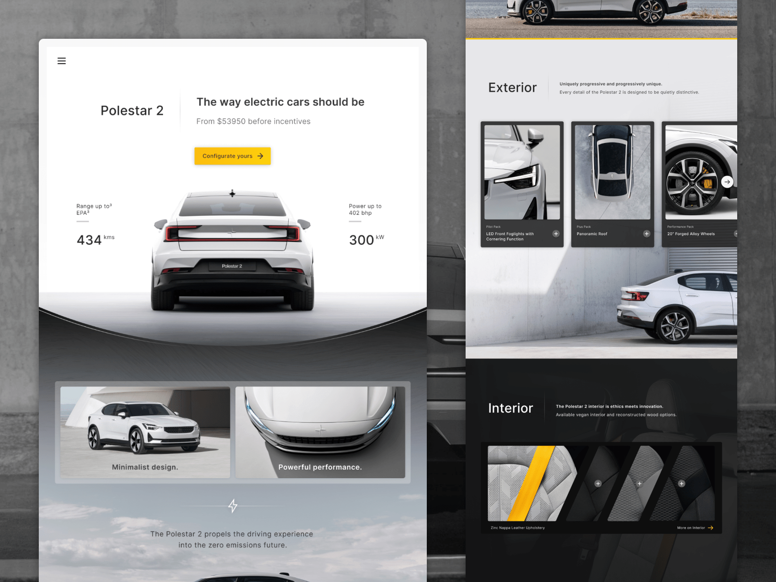
Good User Experience
Good user experience refers to the flow and structure of your website. Poor user experience can turn even the greatest message and most captivating content into a dealbreaker for potential clients. If visitors can’t find what they’re looking for quickly and easily they will simply look for an alternative. Just think of the last time you were looking for a restaurant, mechanic or dentist — how quickly were you able to scroll through countless pages and find new options? With the amount of options available online, we’re quick to look for new options at any signs of confusions or frustrations. So, it’s vital to consider user experience and ensure your website is easy to use and navigate.
One method to genuinely understand good user experience is by designing with empathy. You may be an expert in automotive plastics manufacturing, but the potential clientele visiting your website may not have the same knowledge and experience as you. They were not sitting next to you while you designed your website, they’re looking at it with fresh eyes — and most likely, for the first time. Design for your target audience and design for the flow of how such target audience would approach your website. From the perspective of both the content and the navigation. Design with empathy and step into the shoes of someone who would visit your website and you’ll find yourself with better web design and better user experience.
Well-Designed & Visually Appealing
Of course when describing good web design we have to consider the aesthetic element of good web design. Although arguably subjective, there are common themes and approaches to design that can produce visually appealing websites. Visually appealing websites commonly use high-quality imagery/video, colours and typography in harmony to captivate their target audience. Well-designed websites have unique visual styles that enhance the website’s message — they take thematic and contextual relevance of the business and apply that to the visual language.
It’s hard to break down exactly what makes a website visually appealing or not, it’s not math or science where we can isolate exact metrics. In general, the use of white space, hierarchy in elements, and overall balance of design elements can create more visually appealing websites. Consider all these factors in totality and attempt to balance them as you design and iterate (and make sure to iterate often). At the same time hone your eye for good design. One way to improve your eye for design is by constantly exposing yourself to the best work available — here’s an article we wrote on finding web design inspiration.
Well-designed websites also compliment existing brand guidelines and provide a new visual dimension for information to be displayed. This is where technology meets art — also known as interactive web design. When taken to creative limits, websites can captivate and inspire visitors.
Seamless on Mobile & Responsive
Designing for web is dynamic and constraints change frequently. Visitors to your website will come from all types of devices and resolutions. And they expect perfection.
As designers we often design for the screens we use and work from. Early on in my design career, I designed on a 27 inch monitor and focused far too much on larger screens — of course I would test on all resolutions to ensure it looked good. But admittedly, my intentions were to design for the larger screen size. But everything changed when I had to design from my 13 inch MacBook Air. I adjusted and designed for smaller/medium screen sizes due to my constraints. But nothing fundamental changed with my projects, just the available tools I had altered the outcome of my work. Realizing this, today I attempt to design for a broader range of screen widths and try not to focus on one screen size.
Many designers face this problem and I hope my experience can help both designers and business owners understand that mobile/responsiveness design should not be an afterthought. Your design should be elastic — flexible enough to fit any container. From the beginning of the design process it’s important to consider how your website will look on all resolutions and devices.
Put It All Together
Combine these factors and you have a compass that allows you to make better web design decisions. But remember these signs only give you general directions to follow. It’s important to hone your design skills and improve on these aspects over time through trial and practice. If you’re interested in more of our thoughts on these topics or web design in general give us a shout. At Crushing Cones we’re always interested in collaboration and discourse around web design!