

Expanding on my previous article, Signs of Good Web Design, where I discussed general approaches and strategies that lead to good web design — here are two in-depth design-oriented details that make great websites!
Clear Call To Actions
As designers it’s easy to forget the purpose of websites we design and focus all our efforts on aesthetics. But making a website visually pleasing isn’t our only goal!
In web design we use the term call to action (commonly abbreviated as ‘CTA’) to describe prompts on webpages that require users to perform a specific action. Every website has a different purpose and different marketing strategy — so call to actions varies greatly. But generally you should think of the call to actions as “what you want the users to do on your website”. Whether that’s to contact you directly, buy your product, download your e-book, sign up to your mailing list, the list goes on and on. It’s the action you want your users to take after/while looking at your website. Call to actions turn visitors (leads) into potential customers (clients). Without them, you’re asking visitors to merely browse your website with no purpose.
From a design perspective call to actions are usually in the form of buttons or links. Pay attention to websites you frequent and you’ll see how often you’re prompted with CTAs. Get started today. Register now. Free trial. Quick action-oriented jabs. Simple enough? But how should you design your CTA buttons?

Here’s an example of how buttons look for websites. You want buttons to 1. look like buttons and 2. to stand out (depending on their importance). Buttons on websites mimic buttons we see in real life, that concept is called: skeuomorphism. Just like how a button would protrude and stand out in real life so that we know they can be pressed, we want our buttons on websites to be perceived the same way. The most common solution to this is by designing buttons that are in rectangles, like the last few examples. You can add rounded corners and shadows to your buttons so they further resemble physical buttons.
An important concept to wrap your head around when designing CTAs is visual hierarchy. Visual hierarchy refers to the principle of arranging elements so that information is viewed in a certain order based on importance. What does that mean?
Let’s say you open a menu at a restaurant, imagine all the text you see is in the same font size, weight, colour and set in equal spacing. Nothing to highlight importance or guide readers. Just a block of text.
Visual hierarchy is a principle you should apply to web design in general but it’s especially important for designing CTA buttons. You want to guide your viewers visually so they can easily understand the action you want them to perform, without compromising the rest of your content.
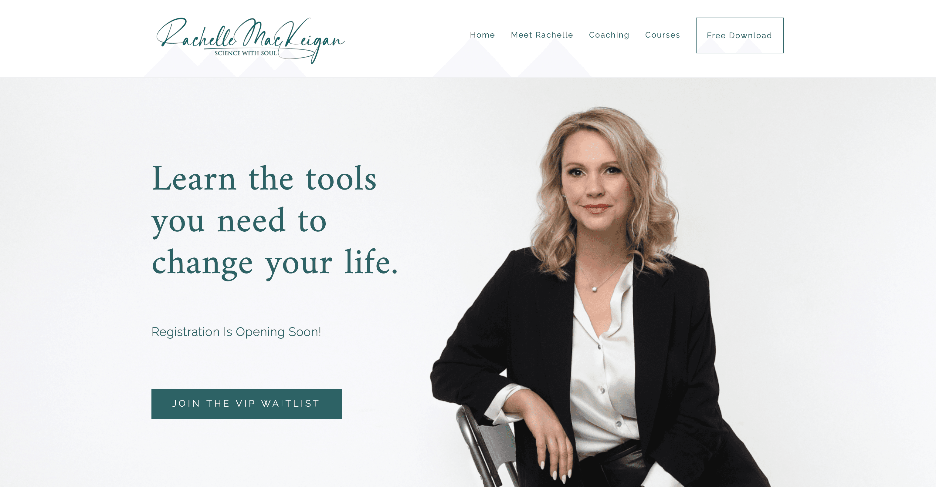
Here is an example from a web design project we’re currently working on. The way your eyes flow from headline to the button, to the image, up to the header and through the navigation buttons — that’s called visual hierarchy. Notice how we utilize white space for elements to flow smoothly amongst each other. Elements are sized/designed differently so your eyes are purposely drawn to each section as you view it — the content isn’t fighting for your attention. And your eyes naturally focus on the CTA button after seeing the headline.
The example above also illustrates that all your CTA buttons don’t have to be the same across your website. Most websites will have primary, secondary and even tertiary buttons — based on importance. Here we see an example of visual hierarchy in button design. We want visitors to focus on the button under the headline and decided not to crowd the page with additional focal points so the button in the navigation is designed to be more subtle.
Use Colours With Purpose
Choosing colours can be daunting and tricky for web design projects. But it’s much simpler if you recognize that design has a purpose. Don’t think about choosing colours like painting a house — where you can choose any colour imaginable for your rooms. You can paint the ceiling blue in your house and it’s perfectly acceptable. Instead, consider approaching colours from a brand’s perspective. Every colour choice should compliment and reflect your brand.
Sit in a Starbucks, McDonalds or wander through a Home Depot and you’ll find the simplicity of colour selection. Close your eyes and imagine a Starbucks menu. Is the text in dark red or dark green? Is the background in a pale green or pale blue?
Now apply that principle to your brand and your website. First find your primary base colour. If you already have one that’s even easier! If you don’t here are several ideas to help find your brand’s primary base colour:
- Learn the psychological impact of colours; consider those implications in your industry
- Research your competitors and try to understand why they’ve chosen their brand’s colours
- Break down your colour into 1. the hue & 2. the tone/shade/tint — use that to help narrow down colour choices (for example: you know you want a darker muted shade as your primary colour, using an online colour wheel you can narrow down your choices by focusing on a certain shade you’re after. And of course vice versa if you have a certain hue in mind, you can experiment with different levels of intensity of that hue to find your perfect brand colour!)
With your primary base colour selected the next step is to establish colours for: headlines, body text, accents, buttons and backgrounds. Sticking to the branding principle we discussed, you can experiment with tones/shades/tints of the primary base colour to find these colours. But be cautious not to stray too far from the level of saturation when selecting these colours — except for accent colours. Experiment with your colour as text, as shapes, over backgrounds — try it in as many applications as possible so you can get an accurate sense of how it would look!
When you create a system/logic around the colours you use, the choices you make become more obvious! And in doing so you’ve started to create brand guidelines! Now you can stick to these principles across different marketing platforms and tools. Keeping your brand colours consistent and easily identifiable.