At Crushing Cones, we feel that a solid basis for a successful web design project is open communication, thorough preparation, and keen awareness of the requirements of our clients. Having worked in the Toronto web design space for more than eight years, we have refined our approach to guarantee that every project is completed without a hitch. This is an inside view of our web design process.
Discovery and Understanding
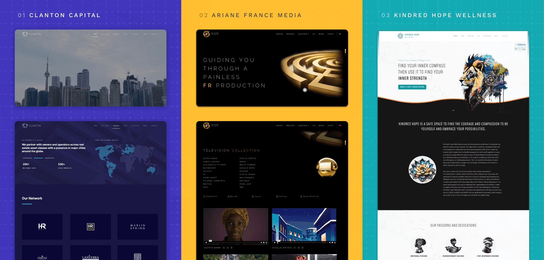
This is the start our client relationship with a comprehensive discovery stage. Knowledge about their brand, offerings, services, and general direction is our top priority. Detailed conversations over the phone, via email, and in person are part of this stage. We determine the main goals of the website as well as its intended readership. In one recent project, for instance, we worked with a client to produce an immersive web experience with three-dimensional forms and a black and yellow colour palette. This first discovery stage lays the groundwork for the design phase.
Design Exploration
We begin our design approach with exploration. We come up with and sketch out several design paths during this stage. Our investigation for the previously described project brought us to the metaphor of a labyrinth, which eventually served as a major visual component. We concentrate on developing a powerful aesthetic direction that supports the client’s idea. This includes trying on various colours, typefaces, and images until you get the ideal fit.
Identifying Building Blocks
As soon as we have a distinct design direction, we pinpoint the visual building elements. These comprise of visuals, typefaces, and colours that will characterize the appearance and feel of the website. For example, we took great care to choose Clanton Capital’s colour scheme and typeface so that they captured the essence of the company. Similar image exploration was done for Kindred Hope, matching images to the brand message.

Collaborative Refinement
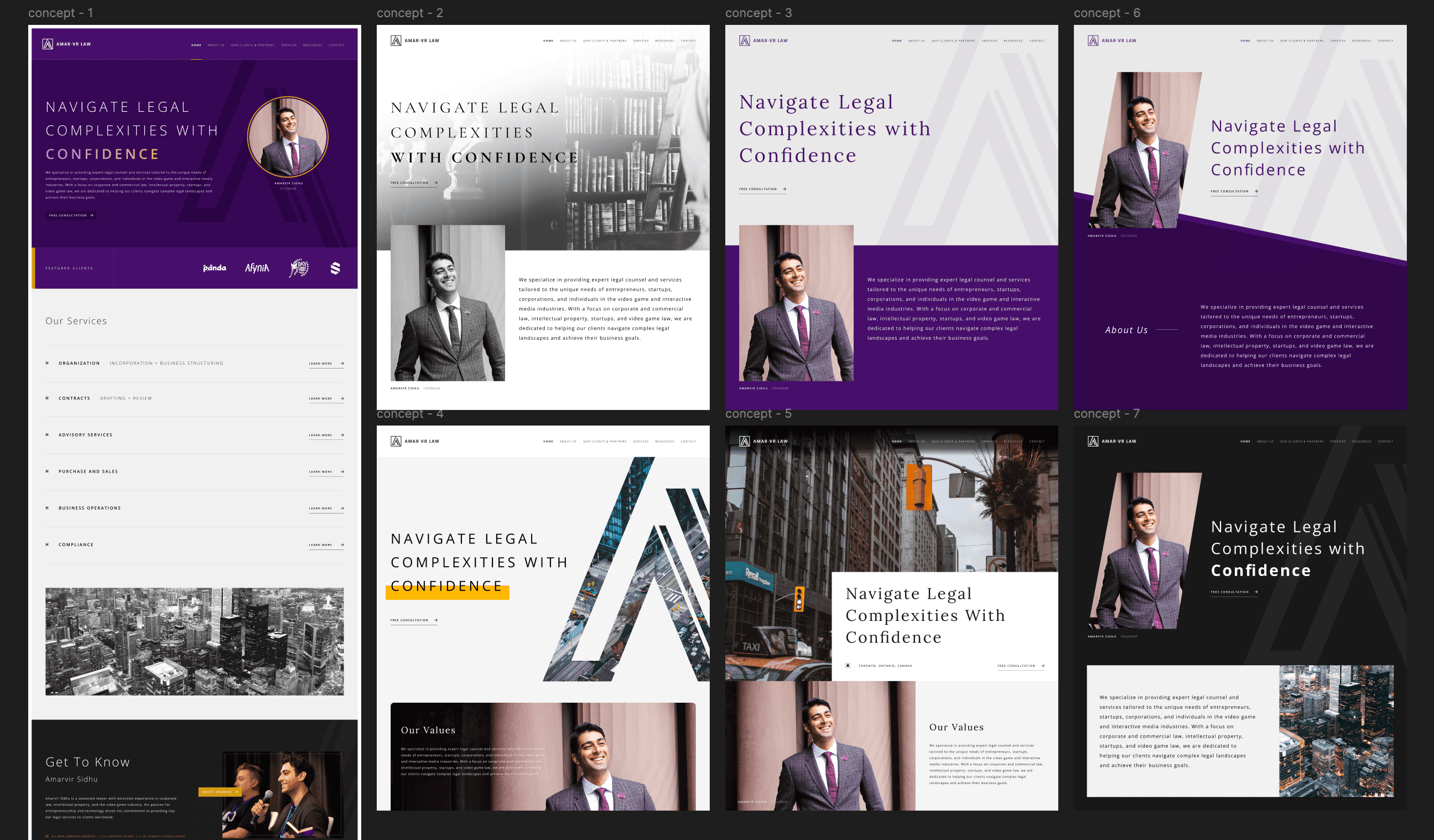
We work best when we collaborate. Working directly with our clients, we present preliminary design proposals and get input. After several rounds of revisions, we polish the designs to perfection. It is our aim to make sure that every concept not only satisfies, but also goes beyond the expectations of the client. The image below illustrates a number of design alternatives for an ongoing project and with the client’s feedback, we found a solution that matched their vision.

Development & Implementation
We go on to the development stage after the design is finished. The website is made practical and user-friendly in addition to being aesthetically beautiful. To guarantee the website functions at its best on all devices, we use the newest technologies and industry standards, with our platform of choice being WordPress.
Test & Launch
The website is thoroughly tested before it launches. We evaluate for performance, usability, and device and browser compatibility. A seamless user experience is ensured by the quick resolution of any problems found. When testing is over, we get ready for launch, working with the client to make sure everything goes smoothly.
Post-Launch Support
Our dedication to our customers does not finish here. To guarantee the website is current and is working smoothly, we offer continuous support and maintenance. We also provide data analytics and insights to help our clients better understand the their website’s performance and make wise choices for future enhancements.
The Crushing Cones Philosophy
With over 8 years of experience in the industry, we have seen trends shift and communication evolve, but our core set of principles remain the same. These fundamental points dictate every project we undertake and ensure consistent results:
- Client-Centric Focus: To guarantee each project is customized to our clients’ particular objectives, goals, and target audience, we start our approach by learning about them.
- Attention to Detail: We believe that each component—from fonts to colors—is essential to successfully delivering a brand’s message.
- Working together with our clients: We make sure that their ideas are implemented and that their vision is achieved throughout the design process.
- Constant Improvement: We are dedicated to improving our designs according to analytics and user feedback so that our websites work incredibly well in addition to looking fantastic.
- Developing Long-Term Relationships: Our goal is to establish enduring relationships with our clients so that we can continue to support and improve their online presence.

Conclusion
Our path at Crushing Cones is evidence of our commitment to web design brilliance. To keep creating cutting-edge digital experiences for Toronto-based companies and beyond excites us. Reach out to now to see how we can improve your internet visibility and elevate your online presence.


