
Some consider their website as a landing page, while others create hundreds of them separate from their website.
It all boils down to conversions.
Landing pages are designed specifically with conversions in mind. Although many websites often have the same objective, not all of them are effective.
If you already have a landing page and looking for ways to improve conversions, we’ll go through five optimizations in this article that will help you increase conversions.
If you’re looking to create one, we recommend giving it a shot. Unbounce and Webflow are some of our favourite no-code tools that make it easy to create a landing page without needing any web design or coding knowledge.
Ready to get started? On to the first one!
The Headline
Similar to websites, it’s the very first thing visitors read when viewing a landing page.
But only if done correctly.
If you want to improve conversions, the position of your headline can be as important as its wording. But, it doesn’t have to be complicated.
Keeping it above the fold (visible on initial load) and using words that resonate with your target market will generally do the trick.
It’s important to communicate your value proposition in the headline as the first thing people read. It should clearly communicate the benefits of your product or service and explain why it’s the solution visitors have been looking for.

The Call To Action
The CTA is arguably the second most important item on your landing page after the headline. Use a strong and relevant call to action to attract visitors and consider the following tips:
- Action-oriented language – Words like “free download”, “sign up”, & “click here” can encourage visitors to take action.
- Eye catching – Make your CTA stand out by using contrasting colours and playing around with other styles. You want it to stand out from the rest of the landing page.
- Above the fold – Similar to the headline, the CTA should be the second thing visitors come across when viewing your landing page.
- Don’t be shy – There’s no specific limit on the number of CTAs to place on a landing page, so feel free to add them in multiple areas of the page. Use your best judgment and place them after certain compelling sections.
Use Visuals
The truth is, majority of visitors will glance through your landing page and not read a good portion of the text.
Visuals on the other hand won’t go unnoticed, making it a great opportunity to communicate your selling points to visitors who may have skipped it.
Videos also keep people engaged by telling a story and demonstrating how your product or service works instead of just talking about it.
Remember to keep it simple!
Visuals can be great if used correctly, but adding too many can make it difficult for the visitor to focus on other important content on the page.
No Distractions
It’s a big reason why landing pages are preferred when prioritizing conversions.
It’s easy to get lost when viewing a company’s website. From team photos to resources and articles, it can be quite overwhelming with too many choices and information.
This is why landing pages have gained popularity amongst companies. Keeping things minimal isn’t just beneficial for conversions, but a popular web design trend as well.
The goal is to give your visitor the exact information necessary to move forward in the sales funnel. Avoid external links to prevent users from leaving your landing page and losing the conversion. The primary link on your page should be the call to action. Otherwise, consider opening any external links in a new tab or window to prevent them from completely leaving the page.
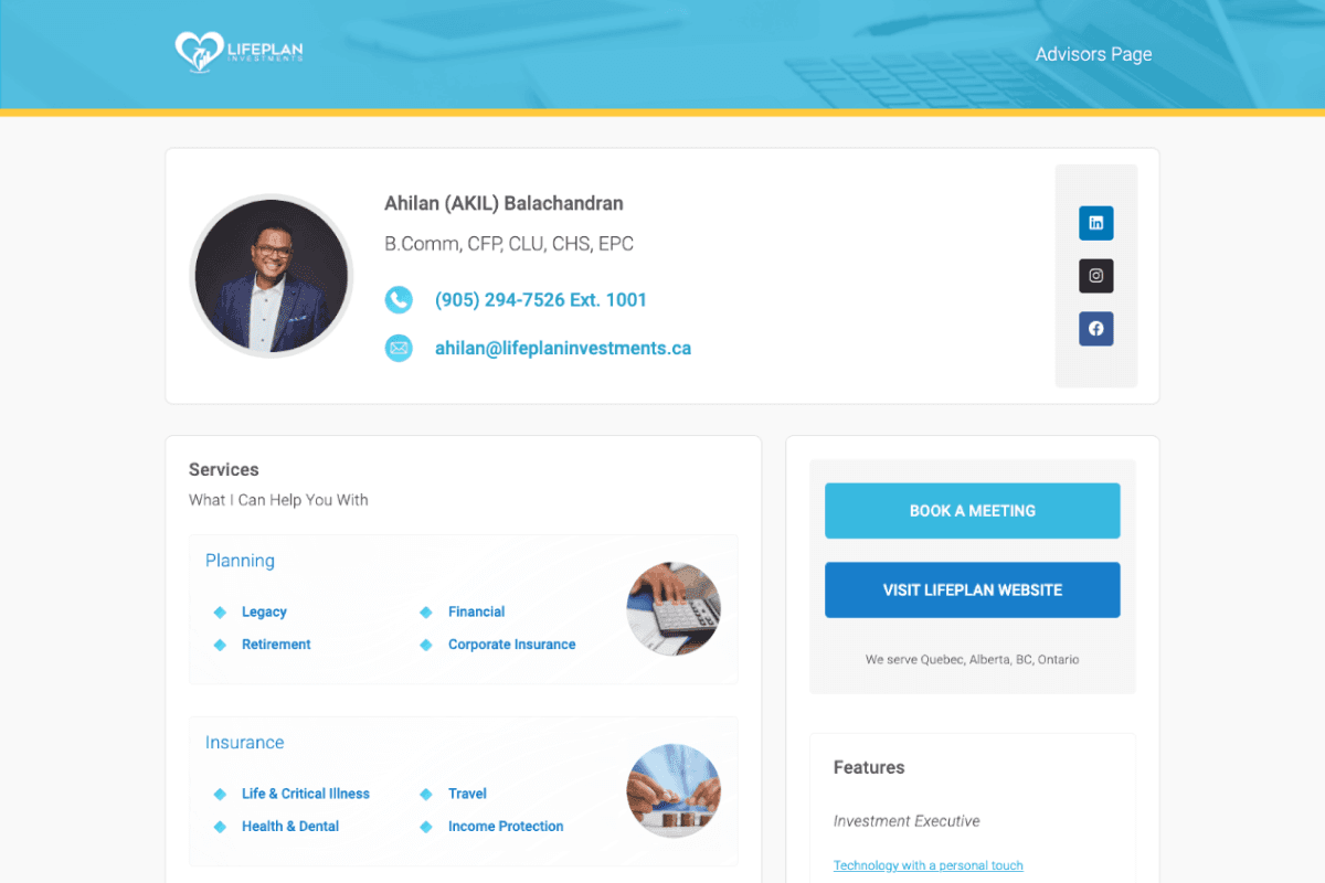
With the below example, all of the necessary information is visible right at the top of the page. The call to action buttons are also styled in a way that stand out from the rest of the page, with external links kept to a minimum.
One at a Time
While you’re still learning about landing page optimizations, it can be tempting to go back and make a number of changes and optimizations to your landing page all at once.
But resist the urge.
If you’re noticing a high bounce rate or not getting the conversions you think you should, try testing one or two optimizations at a time. After that, pay close attention to the data and analytics on the page.
If you’re seeing an improvement in the data, continue with the next set of landing page optimizations. If the results don’t improve, try tweaking things a bit more and try again.
If you’re short on time, A-B testing is a great way to compare two or three different versions of your landing pages. It’s a good starting point that will help you see which optimization efforts have the biggest impact and make adjustments accordingly.
Conclusion
So there we have it. Five optimizations we recommend to help you increase conversions on your landing page.
Just like websites, landing pages should continue to be improved upon from time to time as your business evolves.
In fact, we ourselves use a three step process when creating & updating landing pages for our clients.
The three steps are:
1. Analyze the performance of the page. Some great tools include Google Analytics and heat-mapping tools to gather data on visitor interactions.
2. Test various changes. Many landing page platforms and builders offer built-in versioning. This will allow you to trial multiple variations of the page to determine which changes perform better.
3. Optimize based on the results. Edit the final version of your landing page to include the optimizations that performed well based on testing. Continue monitoring the landing page and repeat this three step process for any further optimizations.
Hope these steps help you with creating and optimizing your landing page. The most important thing is to keep testing and improving your landing page until you achieve the expected results.