
Let’s consider the impact of colours and our relationship with colours broadly first
We all have this gut feeling when it comes to colours. From the clothes we wear, the cars we drive, to all types of products we buy and use every — colour preference is undoubtedly a part of our identity. Some are attracted to bright and bold colours, colours that pop and scream for attention. While others prefer subtlety and colours that blend in. Either way, the colours we choose say something about us.
Today we’re going to dig deeper into our relationship with colours and how to strategically approach colours for web design.
So how did we develop our colour sensibilities? Ask yourself, are there colours that you gravitate towards? Think about your favourite colour if you have one, did you choose it intentionally?
As children, cartoons and TV shows use colours to distinguish between characters — and these identities often times extend to broad character traits. The red Power Ranger. The blue Powerpuff Girl. The green Pokemon. And as adults colours are commonly used to distinguish between brands. In Canada we have two red banks, two blue banks and one green bank. Simple right?
Colours are suggestive and evoke emotions. For example, classically, red is bold and warm. At the same time colours are relevant socially and culturally. Cultures across the world have colours that carry certain significance. They hold meaning and intentions — sometimes positive(certain colours are used in celebration) and sometimes negative(colour customs for funerals).
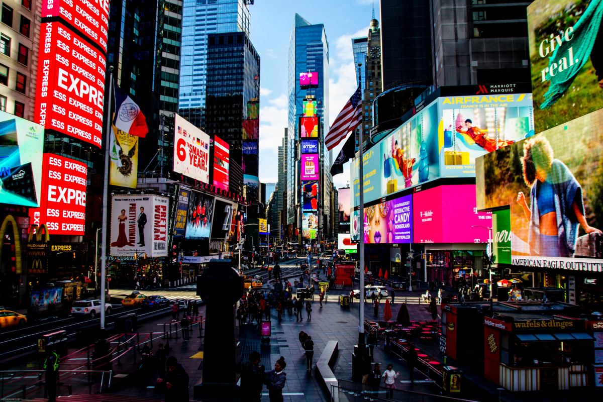
Colours are also useful. They are used as identifiers. In nature, you can spot danger using colour. Dark stormy grey clouds. Bright yellow sunlight. Pick a green fruit? It’s unripe and not ready for consumption. We have examples in modern everyday infrastructure too. I came across a parking lot Jakarta, Indonesia that installed large bright lights surrounding the basement entrances of the mall. Knowing you parked near the entrance with the bright green lights is far easier than remembering “G5”. We see these examples in transit, malls, hospitals and wayfinding systems in general. Like a website using colours to identify different business services, colours are particularly useful at categorizing information at a glance.
Now, how does this relate to web design?
All this to say: colours have a fascinating relationship with us and we should consider our choices deeply be particular about our colour usage. If you see me in a bright red suit, it’s very deliberate and I’m sending you a message. Websites are no different. It’s important to have intention and be strategic when choosing colours.

Getting started in web design — colour selection
Let’s say you have a blank page or a pre-made template and start tinkering with your new website. Whether you’re using a website builder or more professional UI applications like Figma, you have to start making choices. In a way that’s what design is and that’s what colour selection for web design is — making choices. Choosing between A or B — shapes, background images, layouts and of course, colours.
We talked about our gut feeling when it comes to colour. Our preferences and aesthetic sensibility that drives us towards certain visual choices. But with web design there is one extra factor: it’s not just for yourself. We’re not making a website for our own our personal use. In fact it’s quite the opposite. We’re making websites for everyone except ourselves. The end users will have different aesthetic sensibilities and may prefer different colours and design choices. So it’s useful to think broadly and consider the context of colours before committing to your favourite colours.
It’s important to remember that your website is an extension of your brand. If you have an existing brand and an existing colour palette it’s usually the best choice to stick with those colours (as they would match the rest of your brand). Sometimes however, creating a website is a great opportunity to reimagine your brand and start fresh.
For new companies without established brand guidelines the process can be more tedious. Knowing that colours are integral to our own identities, we can try to apply the same principles to brands and websites we design. Like I mentioned, think about what the colours you use say about your brand.

Here are some practical tips and concepts to consider when choosing your colours (whether they are just for your website or for your brand entirely):
Look around you. Do the easiest thing first. Someone has bound to have done their homework — you don’t have to copy it but take a look and see what’s possible. Look at competitors and industry peers to see how they’ve designed their websites. Find out what you like about them and the colours they’ve used. The same way we have banks that are branded with different colours so they don’t get lost in the crowd, you can position your brand based on your peers. You’ll likely find common shades of colours used amongst peers — ask yourself why that is and determine if it’s worthwhile to stick with the status quo or deviate. And if your plan is to deviate, do it with purpose and with reason. There’s a reason you don’t see many neon purple law firm websites.
Now stop looking and start trying. There’s only so much you can learn from obsessing over theory. Try different colour combinations and train your eye to find what works best. Sometimes selecting the best colour will come from trial and error. Again, with the red suit. It’s easy to tell someone how they’ll feel when they see you in a red suit. But put that suit on and you’ll see how they really react. Take screenshots, send ideas to friends and family, get some eyes on it. When you work in isolation it’s easy to get overly attached to ideas — and even colours. Again, there’s no magically or mathematical approach to finding colours for your website. You just want to stand out while remaining approachable.
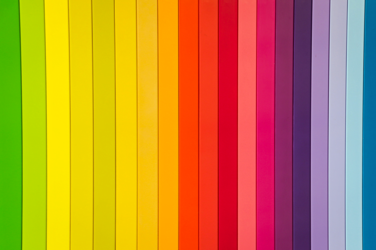
Once you have a primary colour you’d like to use across your website it’s useful to find complimentary colours that can be used along with it. The easiest and most common strategy is to find colours with a similar base hue but with varying shades or tones. Also when selecting other colours (like the example of using colours to differentiate between services) consider ones with similar saturation levels. If you’re using a lighter, duller red as your primary colour you could use the same saturation in other colours to keep the visual theme consistent.
What about light themes vs dark themes? One important consideration I typically make when designing websites is whether we want the overall colour theme to be light or dark. For most businesses lighter themes blend better with existing brands and existing colour palettes (they were most likely designed and created with lighter themes in mind). But it’s useful to consider how the overall theme of the website can impact your colour selection. Sky blue contrasts quite differently on a light background as it does on a dark background.
Overall, selecting colours for your website can be as complex or simple one values it. Hopefully I’ve highlighted some key considerations in making those decisions and some ideas that can get the creative juices flowing.