Toronto + Phoenix + Tokyo
At Crushing Cones, we design and host remarkable websites.
Then we take it one step further.
We’re here to bring your brand’s online vision to life because your website is more than just a digital presence. It’s a space where your audience connects with who you are.


Web Design
We specialize in creating visually stunning, intuitive websites that are custom-built to meet your goals. That’s because we craft digital spaces that not only look great, but also reflects your brand, engages your audience, and delivers real results.

Hosting
Behind every great website is reliable hosting. And we have infrastructure that you can count on. We provide industry-leading hosting solutions designed for speed, reliability and scalability that serve as the foundation for your website.

Automation
Then we take it one step further. Building on the foundation of your website, we develop automation and custom workflow solutions that save time, enhance productivity, and future-proof your business operations.





Tell your story with us.
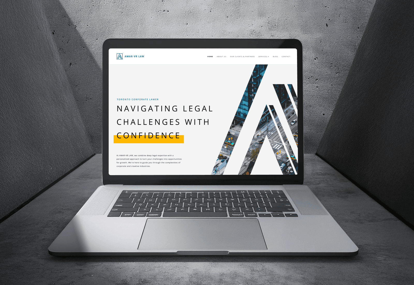
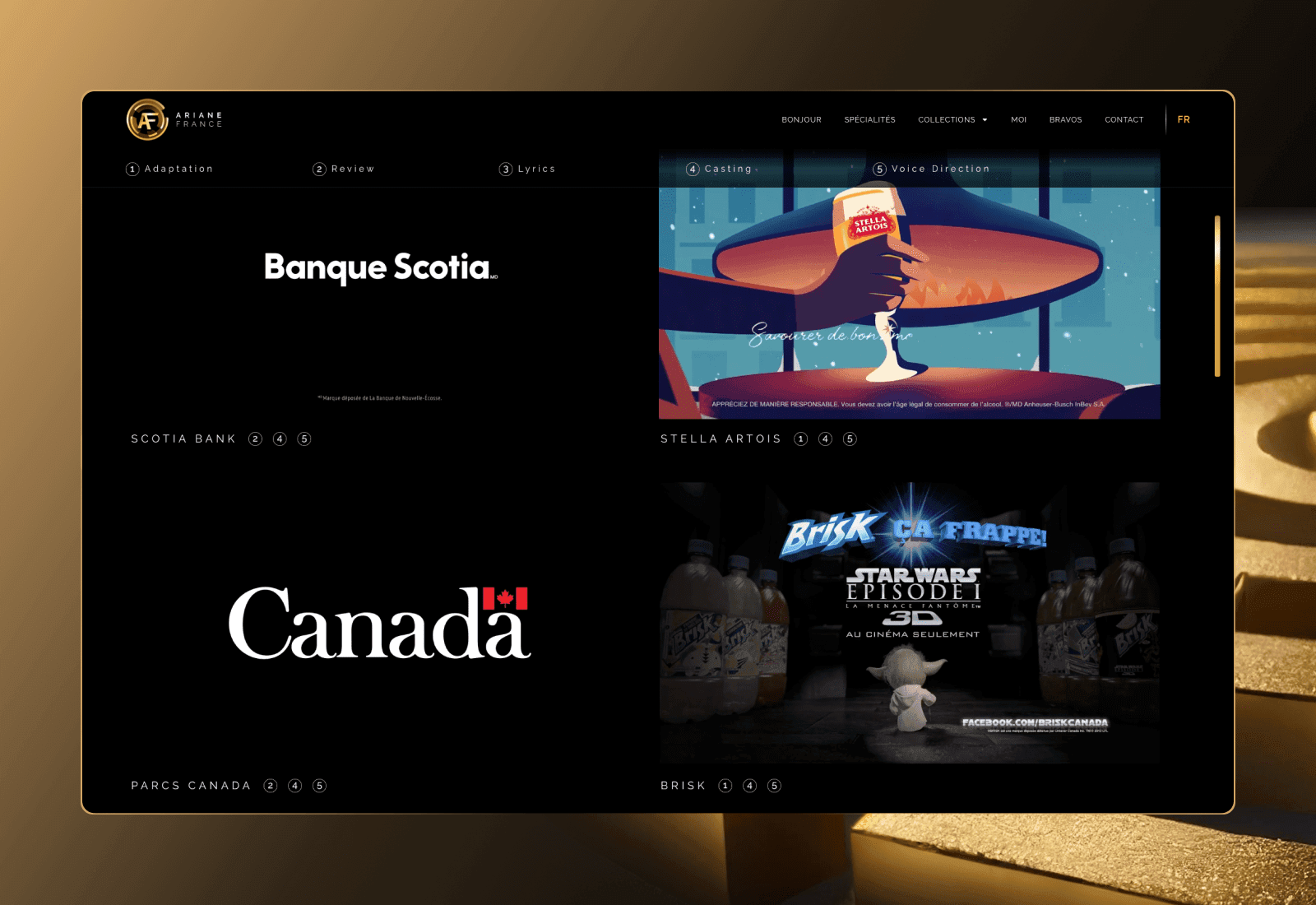
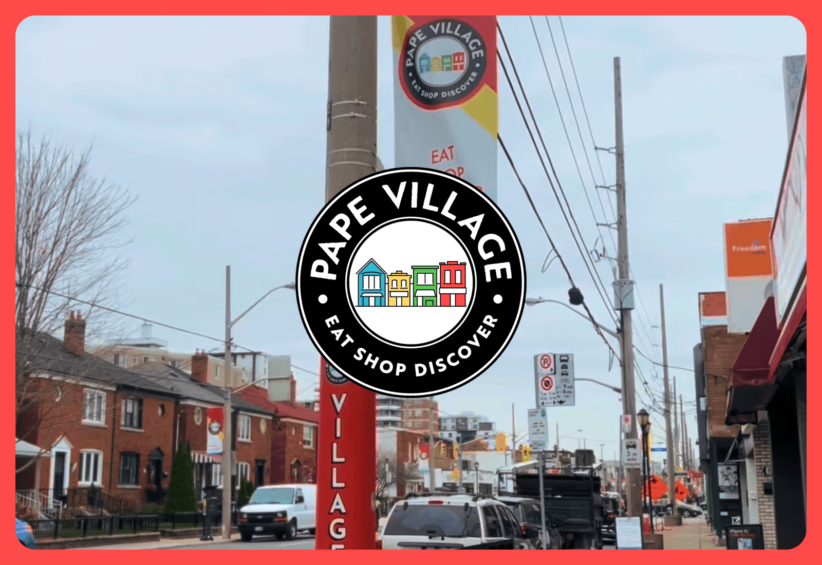
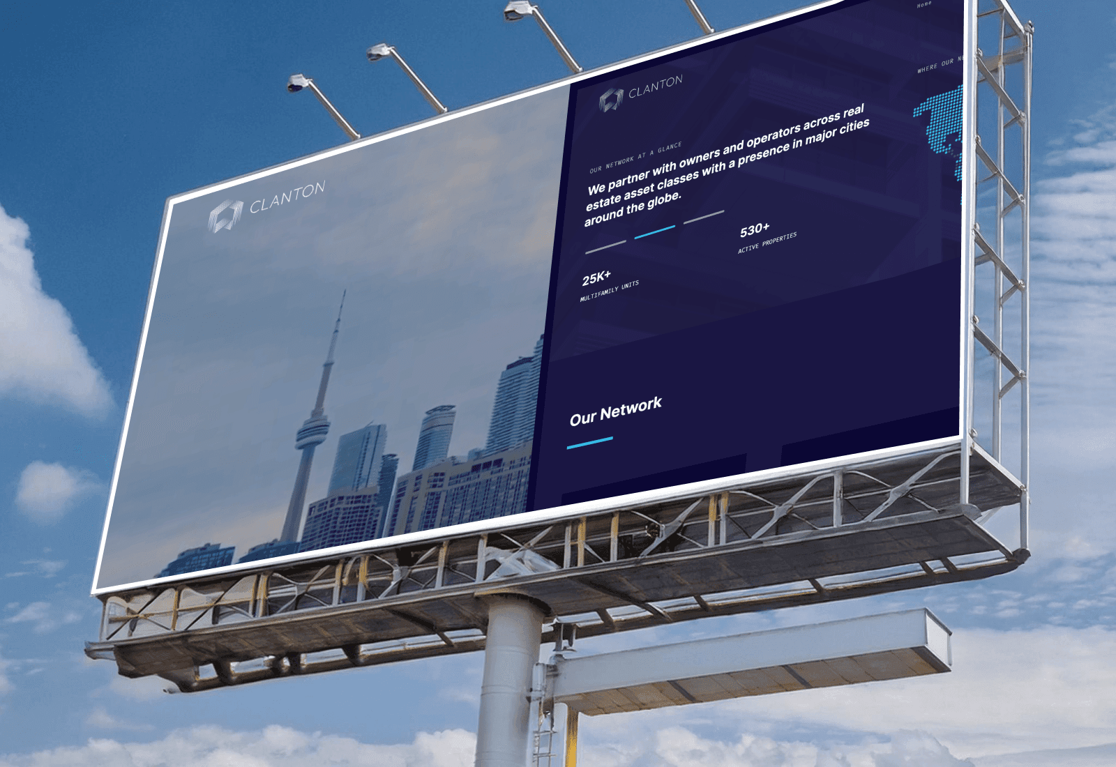
Featured work.
We create websites
that stand out.
We design and build websites that capture attention, engage users, and reflect the unique identity of your brand.
We work closely with you every step of the way, ensuring the final solution is uniquely tailored to your vision and goals.
We approach every project with creative solutions and a commitment to building something memorable that leaves a lasting impression.
No templates here—everything we design and code is created uniquely to fit your brand and business objectives.
We design with long-term growth and future scalability in mind, so your website evolves alongside your business.
How we help.
Our services.
Web Design & Development
We specialize in creating visually stunning, intuitive websites that are custom-built to meet your goals. That’s because we craft digital spaces that not only look great but also reflects your brand, engages your audience, and delivers real results.
UI
UX
E-Commerce
WordPress
Web Hosting
Behind every great website is reliable hosting. And we have infrastructure that you can count on. We provide industry-leading hosting solutions designed for speed, reliability and scalability that serves as the foundation for your website.
Web Hosting
maintenance
Security
Automation
Then we take it one step further. Building on the foundation of your website, we develop automation and custom workflow solutions that save time, enhance productivity, and future-proof your business operations.
AI
Custom automation tools
Airtable


Got a project in mind?
Voices That Matter.
Hear it from our clients.
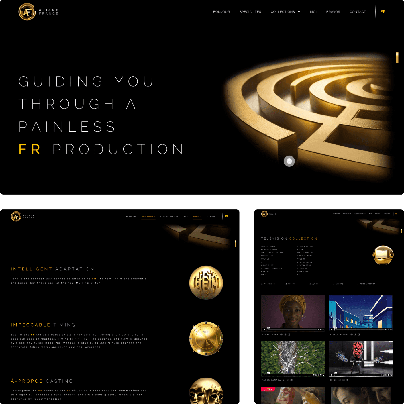
"Working with Crushing Cones has been one of the most rewarding, satisfying and stimulating experiences of my career. Talent, intelligence, clever problem solving, positive attitude and punctuality are a rare mix, and I encountered all these qualities in the design and development of my website."

Ariane France
Ariane France Media
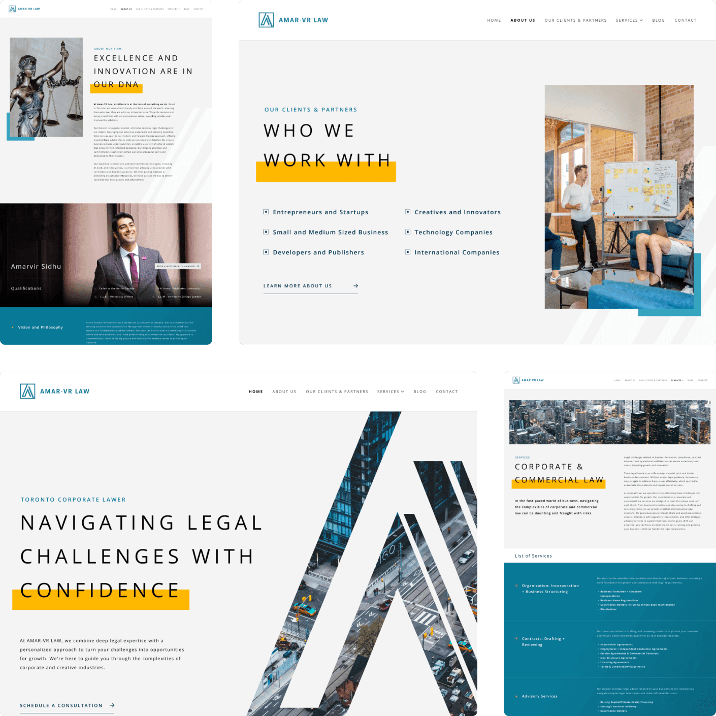
"The team is nothing but professional. They take pride in their work, and as a client I felt valued as they took the time and effort to make sure all my questions were answered. It doesn't matter what purpose you're building your website for, Crushing Cones has the flexibility and skills to build it. I highly recommend their services."
Amarvir Sidhu
Amar VR Law
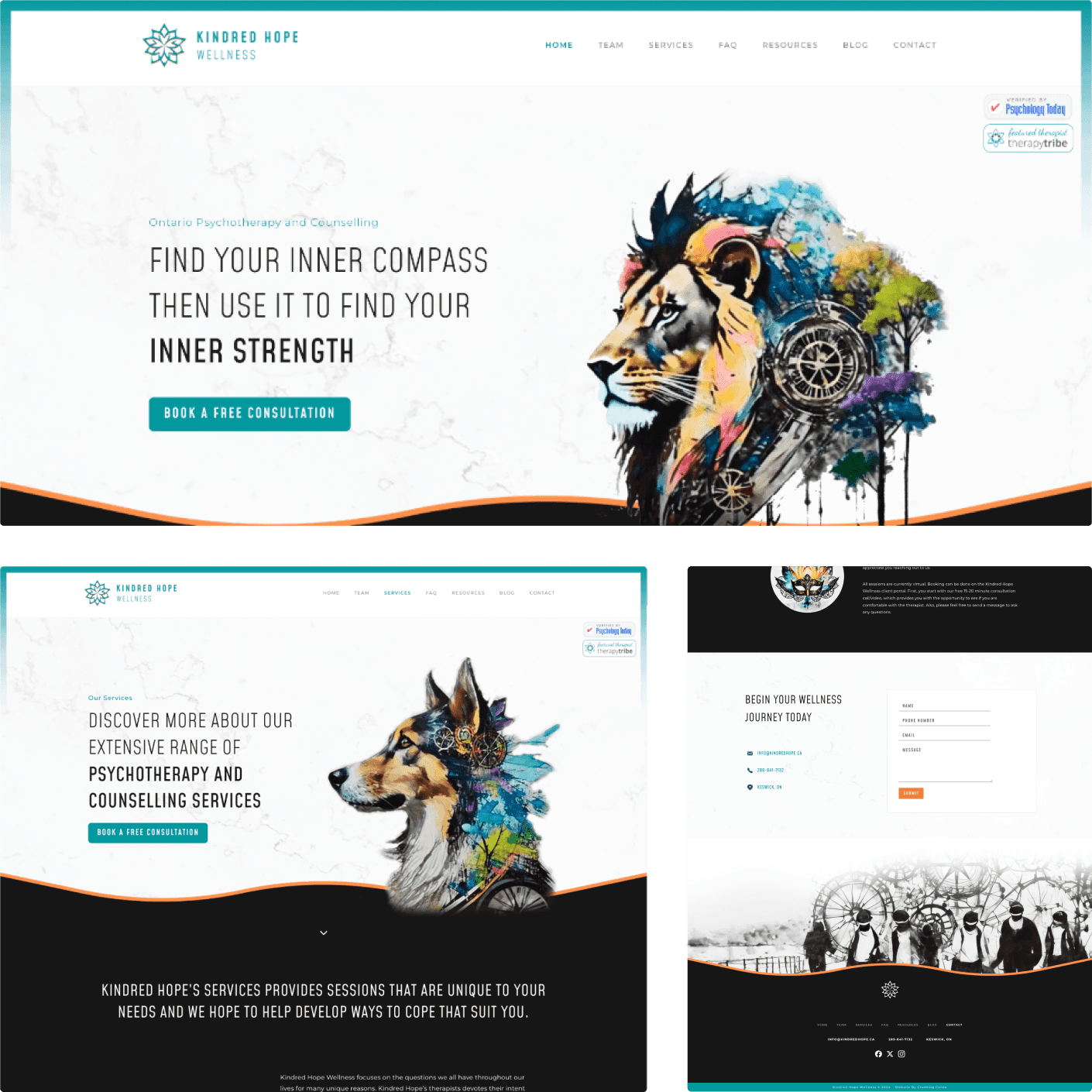
They made my site exactly as I wanted and even better. It is creative, authentic, thoughtful, and shows character. The process with Crushing Cones is a collaboration with your wants and need at the forefront as they guide you with input, suggestions, and knowledge. I am very grateful for the work they have done! Thank you and I highly recommend them!
Trish Joyes
Kindred Hope
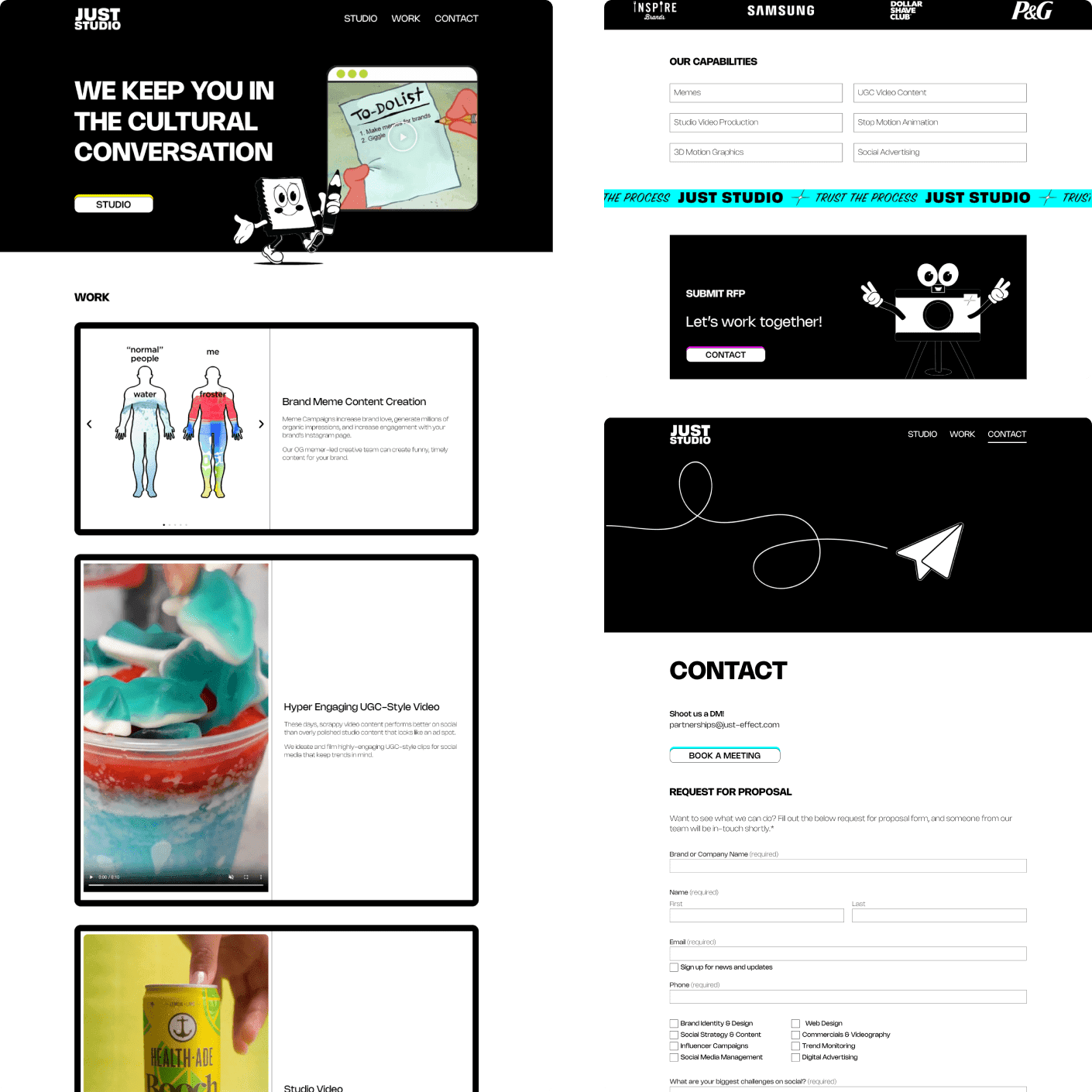
Working with Alvin & Narius was an absolute joy! Alvin is an extremely talented designer, who works fast, truly listens to feedback and shares his expertise around design when you're looking for the right solution. He was always super easy-going and professional through our re-design and I would 100% recommend him to anyone looking for a professional and high quality web designer.

Brianne Burningham
Just Studio
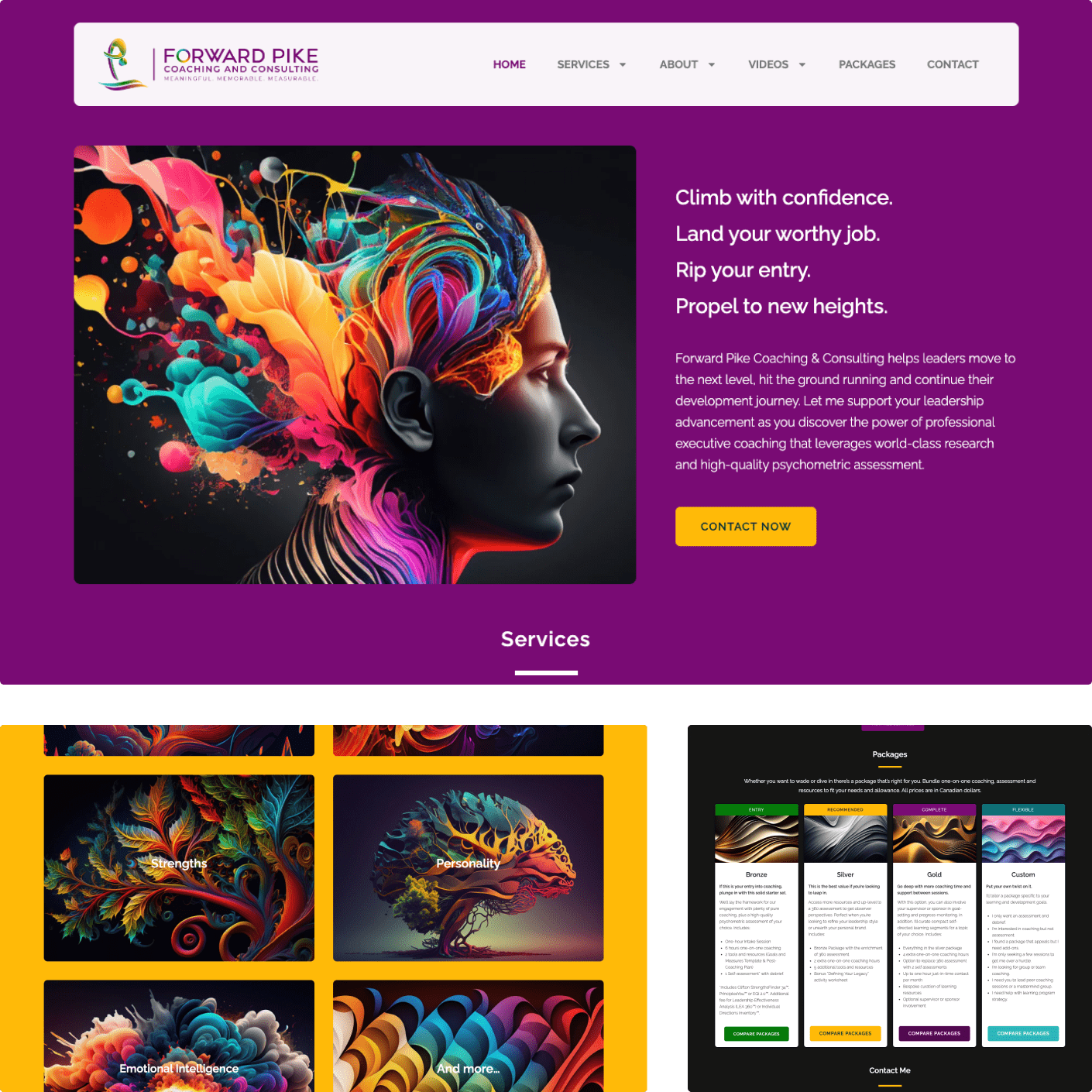
From the first conversation with Crushing Cones, I felt I found the perfect partnership to build my website. The technical wizardry and business savvy of Narius plus the creativity and relationship-focus of Alvin instantly put me at ease. I wanted my website to represent my brand, convey my philosophical approach and look visually stunning. These guys totally “got” me and my vision and embraced it wholeheartedly.
Darcie Clark
Forward Pike
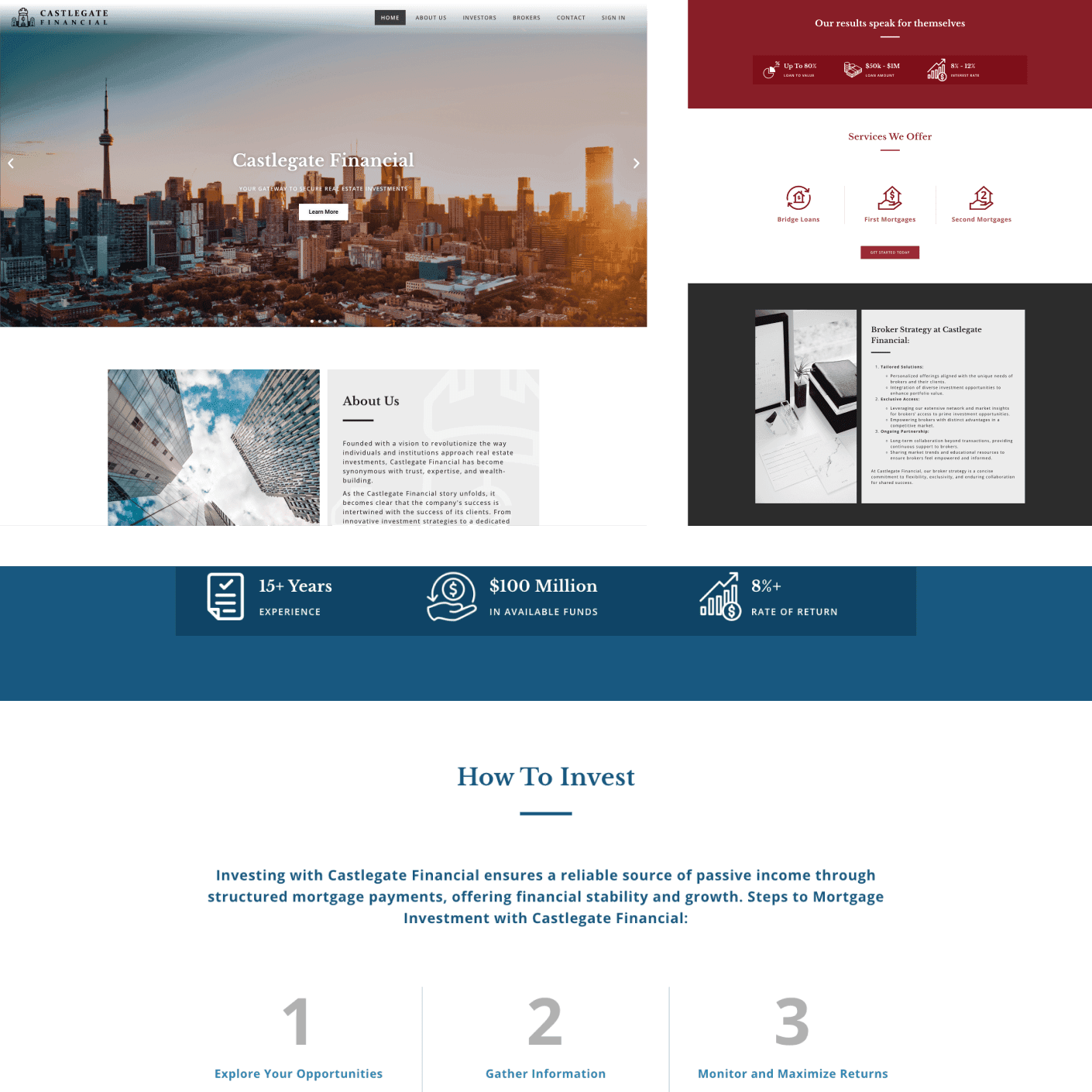
Crushing Cones has consistently delivered on product and customer service, even when we add more requests. They are also very knowledgeable and have advised on certain aspects of the company that may affect the longevity of the website and/or may require further expert advise. I would definitely recommend!
Abi Thava
Castlegate Financial
What We're Thinking About.
Insights from our team.
Quick Answers to Common Questions.
Frequently asked questions.
How long does it take to complete a website design project?
A typical web design process can take anywhere from three weeks to three months. Our timeline varies depending on specific design and development requirements, but we work closely with you and your schedule to ensure exceptional results are always delivered.
Can you redesign my existing website, or do you only create new ones?
Yes, we can redesign existing websites and we work with all major web platforms. Since every websites is unique and built differently, please contact our team for more information.
Will I be able to update my website after it’s completed?
Of course. You will be able to update your website anytime after it’s completed. When we hand-off your website, we will give you information and simple instructions to update and make changes to your website. In fact, your website is completely yours - we make sure you’re in control of your brand.
Will my website be mobile-friendly?
Yes, all websites created by Crushing Cones are fully responsive and work flawlessly on all devices. We take pride in our attention to detail and ensure your website looks exceptional no matter who views it.
How much does a typical website project cost?
Our price varies depending on specific project scope and requirements. For more information, and for new inquiries about specific project details please contact our team for more information.
Do you offer ongoing support and maintenance after the website is launched?
Absolutely. On top of web design we provide hosting, maintenance and extended support for all our websites. For businesses looking to grow, our monthly maintenance packages are recommended. Please contact us for more information.

Contact Us.
Ready?
Let's get started.

We create the digital spaces where brands feel at home:
hello@crushingcones.com
